6th November – 20th December
Mention of Rauch in the Burgert review reminds me that Rauch also has a show on and although I sort of said I wouldn’t write about him again, I’ve decided to take a peek, if only for comparison with Burgert. The artist is of course famously prolific and the current show of sixteen, mostly large scale works (300 X 250cm to 300 X 500cm) are all dated 2014 and reveal no abrupt changes in theme or handling but as usual, shifts of emphasis. Thus, while this year’s show is titled ‘At the Well’ themes of health and nursing continue from 2011’s ‘Heilstätten’ (Sanatorium) as well as perennial interest in bizarre local rituals and costume, small models or symbols of mythic and historical enactment, animal mutation, futuristic architecture or technology, monochrome palettes, fragmented or confused picture planes. It is a rich mix to be sure, but after fifteen years or so market saturation must surely loom.
As a title, ‘At the Well’ suggests replenishment of some sort, or that may be wishful thinking. There is a work titled Am Brunnen (that might be translated as At the Well or Fountain) that shows a kind of confrontation between visitors to a town fountain and attendants or officials. The dispute would seem to be over marketing the water versus its rightful users, perhaps between traditional versus contemporary users, but in any case hinting that a return to The Well (for inspiration at least) is no longer a straightforward matter for the artist. And there are little signs that the flow of works flags somewhat, not so much in less exciting variations as the looser modelling and construction, a slight loss of detail or focus. The pictures have a more relaxed feel, but often at odds with tense situations depicted. There is more of a fidgety quality to brushwork and modelling, where once it was terse.
The sense is that the artist is just a little too comfortable with his formula, the grand impenetrable allegory, and now coasts a little. Oh well, indeed. There are smaller, preparatory sketches that carry lesser content but in the main the artist persists with epic scenes and the effort I think is starting to show. It may be the artist is trapped by his own success here, as are so many others, but a change of formats might be helpful. It may be the artist just needs to slow the production line a little.
Wells or fountains do not figure prominently in the rest of the show. It is more unified by palette and mood. A number of works are predominantly monochrome, a muted umber or sepia, broken by the artist’s distinctive coding for costume, blossom and signs in high key magentas, violets and yellows (Das Felsenwirt (The Cliff Owner), Das Horn, Über den dachern (On the Roofs)) and the combination is undeniably attractive, even chic. The selection is lighter, less intense than in 2011 but at the same time there is nothing as compelling as Das Kreisen or Aprilnacht from the 2011 show. At most, there are rumblings. A number of works from the current show feature stormy, indeed eerie skies (Der Blaue Fisch, (The Blue Fish) Marina, Über den dachern and - my pick of the show – Skulpteurin - Sculptress). In Skulpteurin, a sculptress carves a giant female nude from what looks like enormous intestinal tissue. Significantly, young ladies dressed in short skirts and plunging necklines take on new prominence elsewhere in the show. In Der Blaue Fisch a voluptuous young lady in crimson is extracted from a giant gutted fish, in Über den dachern a young girl leans back flirtatiously against a young man while their entwined hands clad in strange, claw-like gloves perform a sort of dance. Teasingly, the girl’s left arm is hidden inside the front of his overcoat. In the small sketch, Korrektur, a similarly dressed young lady sits at an easel painting a baby red elephant, while her ‘corrector’ looks over her shoulder, affording a glimpse down the front of her low-cut dress. Well, well, well, The Well would seem to bring a certain amount of sexual allure, rarely glimpsed in earlier work, perhaps spelling stormy times.
As noted, the ailing or injured figure is also prominent in Heilichtung (Healing Space) and Hüter der Nacht (Guardian of The Night) more so than in 2011, and might confirm a reading of weariness on the part of the artist. Whether the weariness is just from overwork however, is less certain. Also in Heilichtung, a giant futuristic tower (also used in Hüter der Nacht and previous work), collapses in a column of smoke and flame somewhere deep in a forest, with the implication that the man on the field bed in the foreground is a victim. In combination with the above features, this suggests unfortunate but amusing Freudian overtones. Less fortunate still is the dark blue van in the lower left corner. But here the problem is stylistic rather than thematic. Rauch’s pictorial construction has always emphasised puzzling breaks, usually characterised as a collage method although this suggests pre-existing source material which is rarely accurate. The artist simply shuns spatial continuity at certain points. The trouble is, as his style has developed from an intensely linear one to a more tonal and nuanced one; such jumps are not as easy or effective. They get fussier, more demanding and a little predictable. The blue van is a good example of not quite finding the balance between sketchiness and displacement. In earlier, more linear works this would easily have worked. Now it looks clumsy. This is partly because the style now demands more coherence from the van than there is really the space to give it, partly because the artist now feels confident in tossing off such details as a matter of course. Here the work no more than touches base with preceding examples and for slight reward.
On a more positive note, works such as Marina and Über den dachern build other kinds of stylistic contrast. Both works recycle the strikingly simplified clock tower glimpsed in 2011’s Fundgrube, (Treasure Trove) now given more prominence, emphasising the loosely brushed, summary treatment in contrast with the extraordinary clouds and floating totem of Marina, the lurching background or backdrop to Über den dachern. All flaunt an intriguing degree of stylisation rather than ‘collage’. The more relaxed approach here finds more consistency or structure, still allows figures greater detail but can resist the urge for spatial gymnastics. A lot depends on setting and content obviously but all the same it is risky to strip down a signature style in this way and the artist is to be commended. Ultimately, it is also needed. The question then arises how far Rauch is prepared to go in this direction, what further resources can he muster for the task?
I was not planning to write this much but since the show has had no serious reviews that I could find, it stands. At this point a comparison might be made between Burgert’s global gatherings and tribal conduct and Rauch’s more recondite and historical interests. But it cannot be just a matter of iconography, obviously. There are formal concerns in Rauch that are largely responsible for the work’s wider recognition and that have no real equivalent in Burgert. So far Burgert is no more than a patient compiler of the exotic and outré. Rauch is interesting because he shares many Post Modern concerns; with a debased view of nature or originality, with slippage to pictorial rules or conventions, blurring of genres - yet retains a formal framework distinct from parody and pastiche, virtuosity and academicism – more popular options. He proceeds less by appropriation or quotation than by more generic, less distinct or reputable sources.
Rauch’s first mature works take their cue from something like dated line illustration or dramatic comic strip, graphics syntax and layout therein. While this is routinely identified with Socialist Realism in commentary, neither the artist’s early work nor pertinent examples of the style bear out the claim. It may be one the artist himself endorses but it lacks evidence. A more accurate source perhaps lies with the name of the artist’s art school - Hochschule für Grafik und Buchkunst, Leipzig (Leipzig College for Graphics and Book Illustration). The college was not notable for its adherence to Socialist Realism – quite the contrary – instructors like Arno Rink and Wolfgang Mattheuer already displayed an interest in obscure figurative allegory, an earlier graduate, Eberhard Löbel used Surrealist spatial disjunctures. Bernhardt Heisig, Rauch’s supervisor for his post graduate degree, was actually a Kokoschka-inspired Expressionist, fond of wartime themes. The emphasis on illustration and print format to the institution, however, is surely a more persuasive inspiration than broader ideological doctrine, even if the latter proves an effective sales pitch.
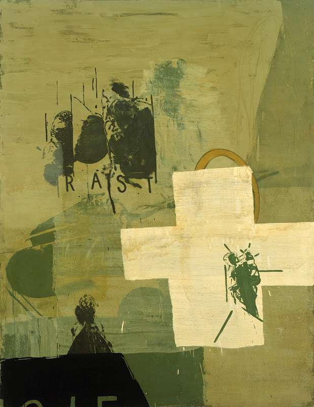
Rauch’s student work (1990-96) is actually quite abstract, commencing from diagrammatic arrangements of text, figures and icons (Der Strom – The River (1992) and Rast – Rest (1993) – Rast surprisingly, in the Saatchi Collection) reflecting lingering Neo-Expressionist influence and only slowly coalescing into architectural projections (Haus 1995) and dated comic-strip figures (Die Grosse Storung – The Big Perturbation 1996). What drives the development is a dawning concern with the inadequacy of illustration or diagram or just plain plan – the implausible, impractical, incomplete and unworkable side of them. Yet the work never quite surrenders to whimsy or caprice – though they are certainly ingredients. Somehow the work retains a deadpan stoicism in the face of the most bizarre situations, a harshness in handling and colour scheme that trumps humour. The work may be about the fall of East Germany, but it is about social dysfunction more generally, which is surely why it has garnered such international appeal.
Similarly, while it has roots in Pop Art, through its print sources and Surrealism in its spatial and scalar disjuncture, no one can mistake it for Pop Art or Surrealism because of the obvious disinterest in realism and obscure print properties to source material. Additionally, photographic sources are notably shunned by Rauch. The work is finally too distant, too different from either style. The labels apply only in the absence of anything more accurate. Yet the project is precarious, as foregoing remarks indicate. As he relaxes his stylistic parameters, the work loses elegance and impact. More realism only makes him more of a Surrealist; more graphics only makes him more of a Late or Post Pop artist. But a style either stagnates or is gradually transformed into something else and it is only to be expected at this stage that the artist and his public’s tastes shift. Nor does it detract in any way from his considerable achievements.
Neo Rauch: ‘At the Well’ @ David Zwirner NYC
2 posts
• Page 1 of 1
Neo Rauch: ‘At the Well’ @ David Zwirner NYC
![]() by CAP » Tue Nov 25, 2014 11:55 am
by CAP » Tue Nov 25, 2014 11:55 am
-

CAP - Posts: 1081
- Joined: Thu Jan 06, 2011 11:38 am
- Location: Off-world
Re: Neo Rauch: ‘At the Well’ @ David Zwirner NYC
![]() by CAP » Mon Dec 22, 2014 1:58 pm
by CAP » Mon Dec 22, 2014 1:58 pm
I've since come across Tom McGlynn's review on Brooklyn Rail which is a bit verbose but at least goes beyond paraphrasing the Zwirner press release, which is what most online reviews have been. 
-
CAP - Posts: 1081
- Joined: Thu Jan 06, 2011 11:38 am
- Location: Off-world
2 posts
• Page 1 of 1
Who is online
Users browsing this forum: No registered users and 72 guests