This article also appears on CAP'S CRITS where it has the advantage of opening links in separate windows (making it easier to toggle between text and illustration rather than linking back and forth).
(5,329w)
The vast Sigmar Polke retrospective at MoMA New York is hard to ignore, even on the web. Not least for the torrent of reviews it has generated, ranging from the ecstatic (Jason Farago for The Guardian) to the dismissive (Lance Esplund for The Wall Street Journal). In terms of number of works, (265) the show is probably the largest solo survey ever undertaken by the museum, although even when spread over eleven galleries, surprisingly, less wall space is devoted to it than previous surveys of Gerhard Richter and Martin Kippenberger, a fact pointed out by Jerry Saltz on Vulture.com in an approving review for the artist but a disapproving review for the museum. Closely hung shows have usually been a feature of the artist’s exhibitions (although The Tate Liverpool’s 1995 retrospective was more generously spaced), presumably his preference was for a flow or battery of works over contemplation of the isolated masterpiece. However, this posthumous survey was not obliged to observe his wishes, just as the curator Kathy Halbreich, declined to organize the show around recurrent themes, the artist’s wish, in favour of a traditional chronological arrangement. Criticism of a cramped or crowded show is therefore valid but it is really part of a much deeper problem in grasping the nature of Polke’s work.
Consensus amongst reviews finds Polke’s oeuvre bafflingly diverse in themes and means; scale and style, something Halbreich’s catalogue encourages. She titles the show Alibis and projects German war guilt to the term, so that the artist’s output is seen as essentially disavowals of established or fashionable tastes, as an expression of post-war impatience with Germany’s ‘economic miracle’. The artist is seen as maintaining many, if any styles, of deliberately excusing himself of consistency or conformity. But this simply fails to account for gross differences between Polke’s work and that of his German contemporaries, indeed of the very notion of artistic change and then again, for undeniable consistency across his oeuvre. As explanation it is too broad, utterly trivial. For all Polke’s irreverence and experiment, his hippy lifestyle and mysticism, it is well to note that he remained at the Dusseldorf Art Academy from 1961 until 1967. There he was under the supervision of Karl Otto Gotz (b. 1914 - and celebrated his centenary in February!) and Gerhard Hoehme (1920-1989). Importantly, both artists were committed to the Informel school of abstraction, emphasising novel materials and applications. Contrary to claims in some reviews, Polke was never a student of Joseph Beuys, although assuredly aware of his teachings. Like Richter, he tended to keep his distance, although always anxious to position himself in relation to controversy. Indeed, the well-publicised connection between the two former East Germans, beyond attraction to Pop Art, is usually exaggerated in the interests of a broader ideological picture. Polke, originally a Silesian or Prussian, left there at 12, Richter, an Upper Saxon, at 29; their experiences and temperaments vastly different and Richter only a student at Dusseldorf from 1961 to 1963.
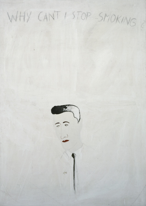
A closer history thus proves far less convenient or convincing. But we glimpse an ambitious student who from the start gravitates to the avant garde, perhaps a little too quickly for his skills. He participates in his first group show in 1963 (the self-organised ‘Demonstration for Capitalist Realism’ with Richter, Wolf Vostell and Konrad Lueg). He wins the German Youth Art Prize in 1966 (with Klaus Geldmacher and Dieter Krieg) and has his first solo show at Galerie Rene Block in Berlin, also in 1966. He is then content to complete his post-graduate degree the following year, anticipating a career in teaching. Clearly there were limits to his scorn and rebellion. There is also the exacting technique of hand-painting the dots to a greatly magnified halftone screen for photographic prints that Polke allegedly never delegated to assistants and maintained in impressive numbers throughout his career. The sheer diligence required should be set against claims of an artist in love with impulsive provocation and rejection. Plainly, it is not enough to see Polke as mere symptom of his times and place at their most sweeping, to see the work as otherwise wilfully chaotic or capricious. It is this lack of discrimination, as much as the artist’s undeniable versatility that ultimately flaws the selection and presentation of Alibis. What is needed is more formal or stylistic analysis, a little more method to the madness.
Polke’s starting point is Pop Art, in particular the examples of Andy Warhol and Roy Lichtenstein. But where they specialise in conspicuously print-sourced imagery, initially Polke deals in the kind of ‘pictorials’ that often accompany painted signage for shops, delivery vans or modest hoardings. The imagery may appear in publications, but generally it is cruder in drawing and tone, yet richer in colour, favours basic trompe l’oeil but seldom convinces. It is Pop Art at the periphery. The transfer from painted advertising to fine art still carries some of the unnerving accommodation of formal pictorial values for advertising, but the transfer has a slightly different emphasis. It is less concerned with the transcription of source image than shifting function or context. Nor is this strictly Dada, whereby the advertisement might be physically transposed as collage or a readymade, but which would then miss the transposition of just the advertisement’s style, its content and formal properties, particularly as understood under Modernism. Pop has a more selective agenda. But as the title of the group show ‘Demonstration for Capitalist Realism’ suggests, Pop is here wittily conceived as the counterpart to Socialist Realism. One advertises collective labour and consensus, the other consumer goods and competition. Or, one nakedly appeals to profit, while the other tactfully appeals to culture. But either way art extends the transaction, can cement tradition or refine business practices but is essentially a modifier, echoing the message in subtle and unexpected ways, spreading and reshaping its sources and referents, to some degree.
The artists thus endorse neither capitalism nor socialism but rather stress the gamut between. It is this broader, deeply equivocal view of social and pictorial issues that gradually emerges as a distinctive project for Polke. It is partly the sheer scope of the project, partly the artist’s suspicion of an overly programmatic approach that accounts for the puzzling variety to his student work. Following painted signage, there are works that adopt purely graphic print sources, alternating or combining with photographic sources, each treated in part or wholly to halftone screen magnification as ‘dot gain’ and printing error and sustained with varying diligence. Then there are sources drawn from printed textiles, clearly related to other print sources and these offer figurative (usually as repeating pictures) and abstract (as design or patterns) options. These are adopted as supports or substitutes for canvas and in turn carry layers of painted motifs, either abstract or figurative or some stylised intermediate. By adopting textile or fabric supports, Polke also grants the transposition of print source to painting a striking double or two-way passage. Painting can be brought to print, even as print is brought to painting. Development for the period thus sees conspicuous print sources of various kinds steadily supplant merely painted commercial illustration, while abstraction is shown to enjoy just as much common currency or Pop value. Other works begin to stretch transcription or compliance with source imagery, so that the spectrum available now encompasses the most modest of sketches that nevertheless retain distinctive print iconography, in other works gesture or facture, pigment and chemical characteristics.
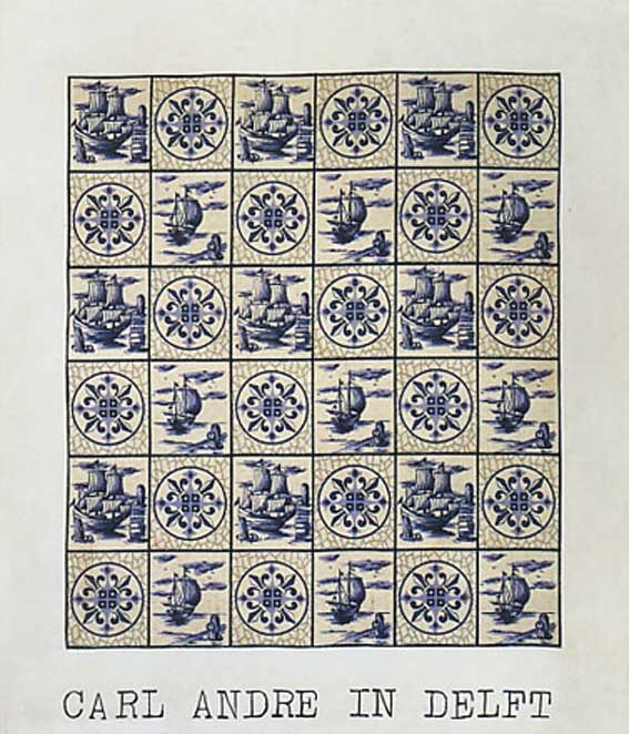
The artist willy-nilly stakes out a range of print citation for painting. The project embraces the kinds of print sources favoured by Warhol and Lichtenstein obviously, although notably avoids the use of silkscreens, for either graphic or photographic imagery and is seldom concerned with distinctive camera traits of focus, lens length, angle and exposure, pursued as source material by others. It is a rich but crowded field for painting, after all. Even enlarged halftone screen dots are eagerly exploited in the paintings of others, such as Gerald Laing and Alain Jacquet at this time. Where Polke finds more latitude is with the integration with abstraction in its many varieties. On the one hand he assimilates the teachings of his professors concerning spontaneous gestures and intuitive judgements to composition, half in jest, but only half. On the other, he paces contemporary developments uncannily, often comically. Much of his use of textiles anticipates or coincides with the interests of Pattern and Decoration painting for example, while his cursory swipes at stripes and modularities surely target Minimalism and later, large-scale staining and pouring of novel pigment solutions evoke Lyrical Abstraction and Process painting. In this respect, Carl Andre in Delft (1968) is a surprising omission, given New York’s association with Minimalism.
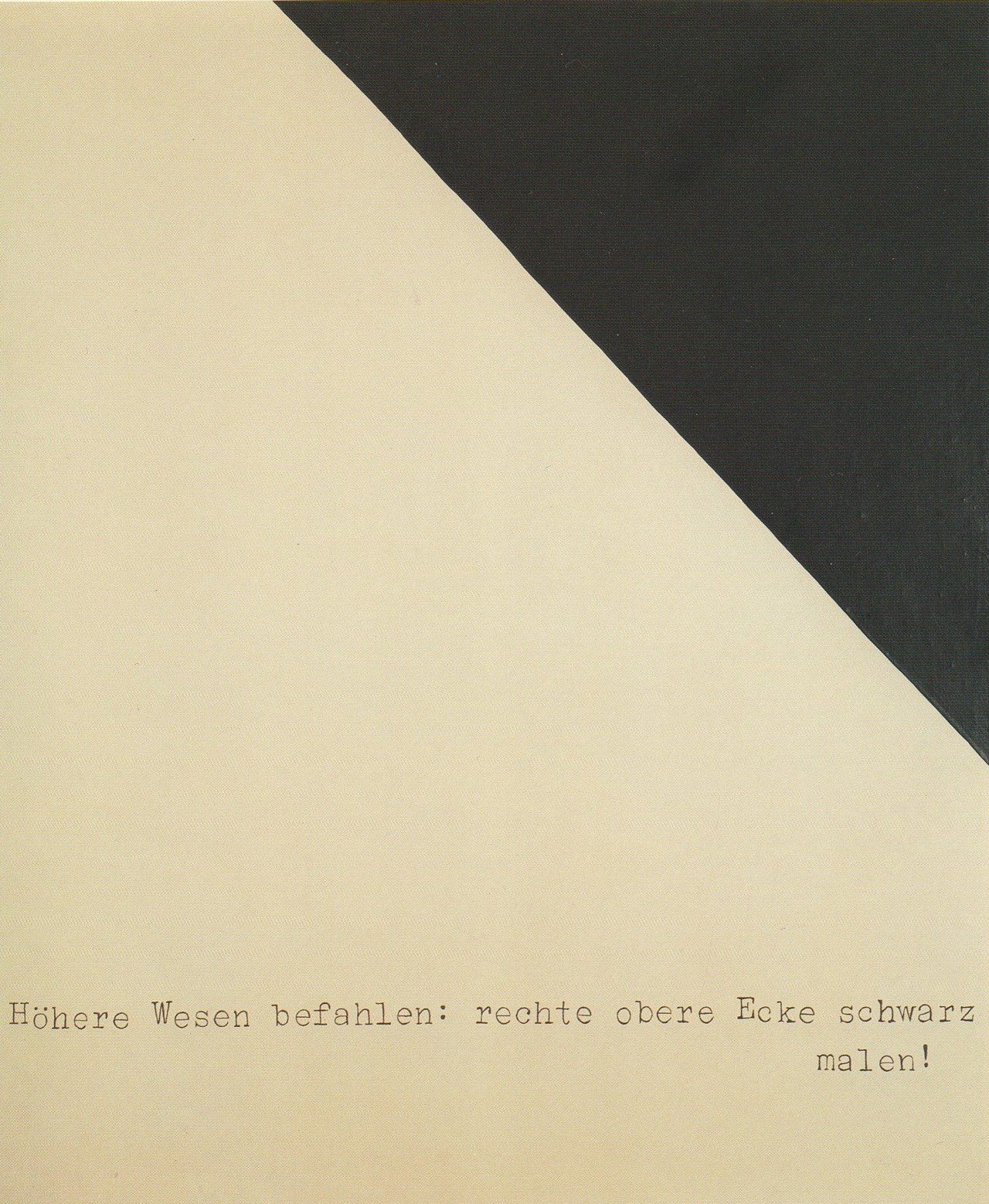
But in all cases Polke advances painting as deliberate quotation of mundane, often overlooked imagery that unavoidably modifies its meaning with the iteration, in some cases mocks the source, in others, deepens it through emphasis on unexpected formal qualities and context. But this inflection only serves to reinforce the primacy of the derivation. The source maintains a kind of authority over even wayward iterations and it is this relation that is sometimes interpreted as a kind of oedipal rebellion, elsewhere as serial contempt. But as Village Voice critic Christian Viveros-Faune realises, “endless debunking” is not really enough to explain the esteem in which the work is held, its actual accomplishment. There is more going on. The formidable appeal to precedent does not remain solely with matters of print form or its iconography, either. It soon entails more complex customs, eventually recondite and occult formulations. A work such as Höhere Wesen befahlen: richte obere Ecke Schwarz malen! (1969) (Higher Beings Command: Paint The Right Upper Corner Black!) mocks or drastically oversimplifies the kind of judgements underlying abstraction, but at what point inherited practice assumes a mystic faith is itself a traditional issue. The work trades on an amusing ambiguity to ‘Higher Beings’ as either spiritual or bureaucratic, through its caption and Courier typeface, but this too feeds into a respectable debate concerning power*. Works such as the occult tables Lösungen V (1967) (Solutions) flatly declare an encrypted or secret formula, while other works from the late 60s pursue more schematic or diagrammatic presentation. There is an element of pacing the kind of documentation that accompanies Conceptual Art around this time, not unconnected with Beuys, but essentially Polke touches upon the farthest reaches of his project here, traces the spread of source prestige from obvious to obscure.
The risk with such breadth of interests of course is that they never amount to more than a procession of fads. The challenge is to convincingly assimilate and unify them, to ensure that the resultant works announce this in a distinctive voice. It is unclear from the profusion of sketches and side projects in Alibis that the artist or curators always appreciated this. Or, it is one thing to stake out grand claims, another thing to adequately realise them. The artist was undoubtedly an eager explorer but that is not to say he did not occasionally lose his way. The fact that so many inconsequential doodles are carefully preserved suggests he could not always tell the difference. The emphasis upon ‘confusion’ as a defining trait in accompanying notes to the show suggests the curators share this folly. ‘Confusion’ may be unavoidable for the artist at the time, from a retrospective or in hindsight we have a right to expect a little more. Too much of Alibis registers as merely desultory self-indulgence. This lack of any firm direction - or identity really - is ultimately what separates Polke from more admired contemporaries like Richter and Kiefer. Polke may have had more to say than either, but too often he has not the time or means to say it as well. Alibis does nothing to alter this perception.
By the 70s the array of sources available to the artist allows unlikely contrasts and combinations in content, so that the work does not just extend derivation from print sources, but mixes and matches it with others. In this respect, Polke’s Pop inspirations grow closer to Rauschenberg and Rosenquist, without quite attaining the gestural arm of one, the formalist montage of the other, yet finding rich territory in between. In Alice in Wonderland (usually dated 1971, in Alibis, as 1972) we find Polke turning to Tenniel’s line illustrations for Alice’s Adventures in Wonderland, for more respectable and pre-Modernist print source and there to merely trace the basic outlines, preserve the iconography but distance print technique. This content is contrasted with the soccer motif to the fabric support (with another kind of childhood association) and the implicitly ‘traced’ basketballer on the right of the painting, striving for another kind of ball and both contrasted with the ‘polka’ dots to the centre and base of the painting. Needless to say, Alice is almost peripheral to this Wonderland, where the game is mainly keeping an eye on the ball, in spite of distractions. But it is the elegant transition from direct printed source of the support to the recognised derivation in the Tenniel illustration to implied photographic source for the basketballer that really announces Polke’s Wonderland, where each step throws open more associations, grants the game multiple goals, absurd feats, an hallucinatory field. Deservedly, this is a much-reproduced work and its inclusion in Alibis provides welcome reminder of its imposing scale at 310.5 X 286cm, considerably loosening drawing to the figures, acquiring an ease and authority the equal of a Rauschenberg or Rosenquist.
Other works from this time are even more explicit in their line tracing, presumably from an overhead projector, such as the Tibersprung pictures from 1971, although again regrettably little of this feature is included in Alibis. A further derivation arises in the use of spray stencils from this time and happily Alibis contains a number of these. Obviously the source of stencil imagery is not necessarily printed but the reusable nature of stencils and the iconography (cowboys, heads of state, street protests) to some extent maintains the connection. Stencils are also inverted or simply appended as collage, elsewhere abused with overspray to further stretch the connection. Together with layering, transparency or superimposition these techniques multiply the kind of ambiguity and links made in Alice in Wonderland. Sources continue to broaden throughout the 70s, notably drawing on erotica, older commercial illustration and art history. An example like Ägyptischer Sternhimmel (1976) a personal favourite, unfortunately also omitted from Alibis, illustrates the mounting complexity of sources by the mid 70s, with its tracing now some distance from the evident source imagery for the Egyptian figures and lesser graphics, the grid of various pattern or abstraction, broader brushwork or gesture. What Alibis does include from this period are less familiar works such as Supermarkets (1976) or simply inferior examples, such as Dr. Berlin (1969-74) but neither really helps to understand the artist’s development.
A more useful example might have been Untitled (1971) with its array of tracing and stencils, styles and sources, gestures and arabesques crowding the picture, cancelling easy recognition and converging upon an impenetrable abstraction. Such overloading is a consequence of trying to assimilate the vast spectrum of interests, technical and iconographic. But interestingly, the intensely linear qualities to many of the sources start to emphasise a shared brittleness or hollowness to images, in part a necessity for layering, but partly a decided lack of substance, a deliberately thin grasp to subjects. This tendency peaks in the mid 70s with works such as Schweineschlachten (1976) and Pille (1976) but it is a sense that persists in later work, even after layering and range of print derivatives are markedly reduced. This shift commences as the artist becomes more interested in novel pigment chemistry, in its spontaneous and unexpected reactions upon various applications. This is another variant on the forces at work with painted imagery - with the chemical forces simply at work with paint. The work has always accommodated the odd drip and dribble, as minor lapse, and highly reflective silver and gold pigments are included by the 70s, but by the end of the 70s massive pouring and drainage to the whole of the picture, and more obscure and unpredictable chemistry to pigments becomes a regular feature. The inspiration for this may in part be the prominence of work by the like of Larry Poons, Jules Olitski and even Linda Bengalis, but as Alibis is able to demonstrate, some of it emerges from the artist’s experiments with photography’s developing and fixing solutions and hand-tinting.
Painting remains his focus however, and an interest in chance gesture also recalls the work of his Dusseldorf professors. But it is the flux-like grounds, the more sweeping pattern to these flooding applications that by the early 80s provide him with an initial direction, a hint from higher, mystic powers against which to match other, more rigid and mundane sources. At other times the deluge conceals or obliterates print sources, is variously wiped, mopped or redirected, on a grand scale. Works still favour printed fabrics for support, but there are also works in which no clear figuration appears, such as Negative Value II Mizar (1982) with its strange violet undercoat, scraped or wiped back in places to reveal an eerie toxic light. Often such pigments carry special light sensitivities, such as the hygroscopic pigments used in Polke’s temporary mural for the German Pavilion at the 1986 Venice Biennale; that slowly changed colour with time of day. But such works represent the extreme of the pendulum swing away from layering and rigid print sources to a single, sustained engagement, a ‘one hit’ of mostly dark intuitions.
The pendulum swings back throughout the 80s, with significant change in themes. Where work of the 70s has a generally brash, hedonistic feel, for sex, drugs and kitsch exotica, by the 80s the themes are more historical, mythical or literary, the tone darker, more restrained. The swing back also coincides with international recognition for Neo-Expressionism (or Junge Wilde) and a younger generation including several of Polke’s students from the Hamburg Academy (where he taught as guest lecturer 1970-71, as Professor 1977-91) namely Martin Kippenberger, Markus Oehlen, Werner Oehlen and Werner Büttner. Kippenberger later recalled “Sigmar Polke: Everybody knew he was the man of the Seventies“. Inevitably, this brings new attention to Polke and boosts his career. The period 1977-82 still sees him showing regularly, but mainly at private German galleries, by 1983 larger galleries in Milan and Rotterdam take an interest, by 1986 his annual exposure has tripled. It is tempting to see the artist drawn into bolder, less equivocal statements by the example of his juniors and with works such as the Watchtowers series (1984) that seems likely. Here, spray stencils of silhouetted towers cleverly play off ominous surveillance, whether concentration camps, Germany’s then east–west border or traditional hunting perches. These self-consciously German themes of course are amply represented in Alibis. But there are other works that are as much a reaction against such loaded subjects, not simply in a retreat to mystic alchemy but a greater interest in tradition and myth. Polke’s development throughout the 80s typically oscillates between the two tendencies, while nevertheless refining the pictorial mix.
A good example of more ordered layering to works is the series that take inspiration from Goya’s etching suit Los Caprichos. Again, regrettably none of these are included in Alibis, where preference was given to around 29 examples of Polke’s alchemical abstractions, a regrettable imbalance in an exhibition promising a comprehensive coverage of the artist’s career. This Is How You Sit Correctly (1982) derives for the main part from Goya’s etching ‘They Have Taken Their Chairs’ but also adds less certain 19th century graphics sources and again uses children’s printed fabric as support. The range of imagery is less diverse now, the arrangement more integrated, the tracing much stricter in parts than in Alice in Wonderland, more delicate in colour, the figures even when ghostly, acquire more volume and substance and play between background pattern or abstraction (between the left and right of the picture) far smoother, more nuanced. Works from this time are rightly regarded as his mature work. What commenced as a tug of war between entrenched print sources and divergent instance, steadily begins to look more classical, an appeal to traditional themes - here superstition - against the vagaries of contemporary means.
The contrast takes on a slightly different cast in a series of works titled Dürerschleifen or Durer’s Loops from 1986, deriving from Albrecht Durer’s large woodcut The Great Triumphal Car (1522). The elaborate allegory on the virtues of the Emperor Maximillian The First contains a looping flourish to each of the constituent woodblocks as an acceptable signature by the standards of 16th century calligraphy. These are not so different from the dashing squiggles used in a lot of celebrity autographs today, really. The flourishes become Polke’s source yet are scarcely evident as such in the large paintings, for example, Velocitas – Firmitudo (1986) the title taken from the corresponding virtues to the signed block. This example is included in Alibis, and singled out by Saltz as one of the show’s few highlights, if only for presentation. We might infer some print source from the fact that it is a Polke painting perhaps, but the salient feature is really the contrast between strict linear loops against a surging tonal ground. One possibly compresses or encapsulates the course of the other or expands or extrapolates upon a linear rendering, but importantly, the flourish is also in front or superimposed upon the tonal ground. It is this layering, not strictly as foreground or sharing a perspective but as something to be looked through or past, a filter or mediation that becomes more apparent to painting for the artist. There are also works from the 90s onward that introduce a wire or plastic mesh across the surface emphasising this filtration, although none are included in Alibis. Earlier works occasionally use bubble wrap to similar ends. The fact that the flourish is actually Durer’s signature at a more obscure level deepens the meaning of course, adds to the artist’s inclination to tradition and scholarship and ultimately hints at an identity issue, as mentioned, lurking in the work since the 70s. But there is also the fact that that the artist was extremely short-sighted, something he raised quite early in his career as disposition for attending to the detail to halftone screens, and which entails just this kind of layered transparency. It is possible to see looking at painting through prints as similar to wearing glasses. It is possible to see Polke’s paintings as thematising or making this aspect foremost.
There is one further development to this aspect in the late 80s, in works that adopt transparent fabrics or scrims for supports. While these are obviously another kind of textile, with another kind of print – a null print in effect – the transparency also reveals the wooden stretcher and braces and declares a fundamental framing and structure to the painting. This would hearten an ardent Greenbergian, if any still exist, but it also grants painted sections a curious isolation, stresses their fragmentary, flimsy nature. A work such as Liberté, Egalité, Fraternité (1988) shows how Polke’s pre-modern print sources are soon disarmed by this transparency; announce a literal lack of background, a curious disembodiment, equally at play in the beheaded victims. In Alibis, the best example of this is Mrs Autumn and Her Daughters (1991) where a gestural ground is overlaid with a 19th century illustration to children’s tales, but tellingly, beyond all pigmental application, we look through even the supporting fabric to the stretcher on the wall, and depending on fabric and lighting, such works can be a gloomy experience.
There are of course degrees of transparency to fabrics used singly or in combination as supports and which may be painted on front, back or both sides. But all finally stress an insubstantial source or destination; a print source that cannot offer enough to extend a support, a support that cannot extend a print source far enough. The project approaches a stalemate. It is notable that even in the poured or gestural abstractions, pigment tends to thin or translucent solutions. This underlines the growing importance of transparency across the work. In figurative works, transparent supports tend to emphasise the scale and placement of opaque layers within the picture frame, as if somehow empty or incomplete. Or, the painted print sample now commands such impressive surrounding space in the picture as counterpoint to its own significance, as a kind of bombast. Either way, transparency offers a further, troubling distillation to the artist’s project. By the 90s the work acquires more polish, as Post Modern eclecticism enjoys more acceptance and possibly technological advances allow the enlargement of halftone screens greater flexibility and refinement. Polke dispenses with mere line tracing to graphics and spray stencils, instead compounds print sources; applies halftone screens to comic strips, antique etchings and even gestural abstraction by the 21st century. Effectively, the work then samples a mass print photograph of prior print sources. Yet more complex print sources only reinforce the essential gulf between rigid template and painterly extension, the artist’s lens and his canvas.
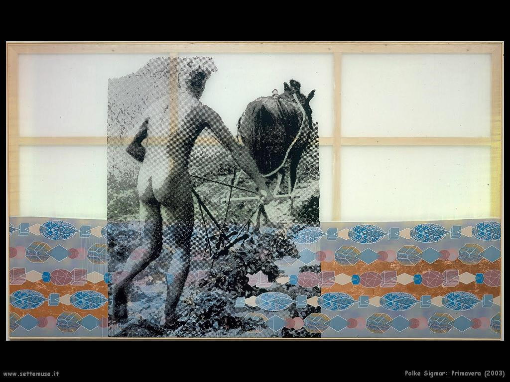
There are two further bodies of work to be considered. The first arises for the exhibition, History of Everything at the Dallas Museum of Art in 2003, later at the Tate Modern 2003-4. The selection of work (1998 to 2003) was made in close co-operation with the artist and included a large number of works made for the exhibition. Again, themes range from full abstraction to historical and mythic events, folk and children’s tales, current political and domestic events. All are filtered through coarsened halftone screens, often applied to transparent supports. In striking contrast, were a series of enormous ink-jet prints on vinyl banners stretched directly onto the gallery walls by grommets around the picture edge; a standard commercial display technique. These are the flipside to layers and transparency. Here there is no gap between print source and support. As if to underline the artist’s choices confined merely to questions of scale and halftone screen density, the ink-jet prints offer precise compliance and presumably raise questions of copyright. It is the stark alternative to not just layers of transposition and transparency but the greater part of the artist’s involvement. The work is no longer strictly a painting, but rather a print, and no longer strictly the work of the artist. These works are represented in Alibis by The Hunt for The Taliban and Al Qaeda (2002) possibly for the artist’s prescient interest in drones, even in 2002. Disappointingly, the companion piece, I Live In My Own World But It’s OK, They Know Me Here (2002) was omitted. This radically enlarges the dark shapes detected by the ray from the drone at the bottom of the picture into an extreme ‘dot gain’ abstraction, painted over various patterned fabrics. The two works bracket the artist’s drive to abstraction with new respect for print source, although flag a bleak reduction of the artist’s signature. While the ink-jet works offered many such interesting points of iconography for the show, especially concerning American ideology, they also announce a troubling appropriation of print sources. ‘Higher beings’ start to look more like hire beings. For Polke, this is not fatal of course, but merely covers one more option to the ever broadening spectrum, but it is one where painting is severely constrained, art gravely attenuated.
The last works to note are the stained glass windows for Grossmünster Cathedral in Zurich made between 2006 and 2009. These are a fitting climax to the artist’s career in a number of ways. From his initial training as a ‘glass painter’ in 1959-60, to a more conventional or institutionalised spirituality, to a more explicit reliance on transparency and illumination, to transformation of novel materials (extremely thin slices of agate supply the concentric shapes) even within the rigid structure to stained glass and surprising variation on traditional iconography – in all ways the Grossmünster windows advance the artist’s project one final step. Inevitably, there are comparisons with Richter’s stained glass windows for Cologne Cathedral (one German, Catholic, the other Swiss, Protestant) and while both ingeniously serve their respective churches, this is one time Polke more than holds his own. Naturally these works could not be included in Alibis, but are rightly presented in a slide show. What is absent however is an adequate framework within which to appreciate these achievements. For that, a more discerning selection was needed; not one blinded by the artist’s sallies into film and photography and copious preliminary sketches, but one prepared to stand back and apply a little more perspective.
While it is understandable Polke would be drawn to aspects of movies and photography, since they comprise a good part of his source material, his efforts there are indifferent, eclipsed by contemporaries. At best they confirm the primacy of painting for him; at worst they severely distort the course of his career. The period 1963 to 1970, is represented in Alibis by 107 works, leaving roughly 158 (depending on how one divides the works) to cover the subsequent thirty years. Even allowing for the small scale and minor nature of many of these early works, it makes for a glaring imbalance. The flaw is amplified in the case of Polke where his circuitous working methods resulted in his best work coming later in his career. We see far too little of the 90s and 00s, and Saltz’s complaint that there are few standout works, rests not just with presentation but wayward selection. There is nothing in Alibis with the sheer beauty of Cook Up Art With A Culinary Flair (2002) or the cool provocation of The Fastest Gun In The West (2002) because the curators are intent upon previously unexhibited work, irrespective of merit. These small pockets are better examined in more specialised shows. Holland Cotter, concluded ‘It’s easy to envision a more tightly edited take on this artist, one that would make him look more ordinarily Great. But it turns out that his career is more interesting and unusual when seen episodically, mixed up, en masse’. The trouble is, taking in the more errant byways, does not leave room for much of a glimpse of his ‘Great’ career. We end up with not so much en masse as on misses.
As a Polke survey, Alibis might usefully be twinned with the Grenoble show from the start of the year, which managed with something like 120 works, from the 80s to the 00s yet was probably more astute in surveying the artist’s achievements. But Polke retrospectives have been a rolling staple for museums since the mid 90s. The Hamburg show from 2009, Wir Kleinbürger Zeitgenossen und Zeitgenossinnen (We Middle Class, Contemporary and Contemporaries) usefully surveyed his 70s work. It won the International Art Critics Association award for German Exhibition of The Year. The catalogue to the 1997 German retrospective, Three Lies of Painting, continues to be the benchmark in Polke scholarship. At this point Alibis reads more like Scraping the Bottom of The Barrel as far as the Polke oeuvre is concerned. It might be time for museums to take a break from the artist. A number of reviews are confident he is a vital example for younger artists, but while his dedication and independence are laudatory, the shortcomings are also abundantly clear. My feeling is he belongs to another era and the establishment now, and that art students of today will feel too distanced to find much inspiration. Alibis next moves to the Tate Modern in October and it will be interesting to see what their man Mark Godfrey (an assistant curator on Alibis) does with a very different space. It is hard to see much margin for changes in selection though, hard to see a London public that remembers History of Everything from 2004, getting too excited or buying the excuses.
*Jörg Heiser’s memorable interpretation of the top right corner of the painting as allusion to Hitler’s distinctive hairstyle, also deserves mention.
Sigmar Polke @ MoMA New York
1 post
• Page 1 of 1
 Sigmar Polke @ MoMA New York
![]() by CAP » Thu Jun 05, 2014 3:31 am
by CAP » Thu Jun 05, 2014 3:31 am
-

CAP - Posts: 1081
- Joined: Thu Jan 06, 2011 11:38 am
- Location: Off-world
1 post
• Page 1 of 1
Who is online
Users browsing this forum: No registered users and 210 guests