Joyceland - 26 March – 10 May 2014
(3,486w)
I’m reviewing this for a couple of reasons. I mentioned Pensato a few years back on a thread about George Condo, concerning cartoons given the painterly treatment and since this is her most publicised show in London, I thought I would expand a little on that. The other point is about older artists being discovered or re-discovered by ‘the market’ (read bigger galleries, their curatorial and critical allies) and what this says about the American market generally, other markets incidentally. I have, of course, a vested interest in this angle and so deal with it first. Joyce is probably in her 50s – all her CVs are pretty coy about a date of birth though, which is frankly pathetic but this is probably more gallery marketing than female vanity. Joyce herself is hardly pushing an ageless image, to judge from the You Tubes at least. And this recycling may well be connected with the choice of Lisson as her current London gallery.
It is a strange choice on the face of it. When you think of Lisson, you think of austere Minimalism or Conceptual Art – Marina Abramović, Allora & Calzadilla, Richard Deacon, Dan Graham, Santiago Sierra, Lawrence Weiner... It’s your heavy duty emporium of the avant-garde. That’s the brand. It’s like Matt’s Gallery, only rich, up town. Going there is like a trip to the dentist – every now and then it’s for your own health. I might have missed a change in policy or management recently, but Lisson is just about the last place I would have placed someone like Joyce Pensato. In 2011 she showed at the General Hotel Gallery, in Bethnal Green which has now closed. My guess for a replacement would have been somewhere like Maureen Paley or Frith Street, Greengrassi at a pinch. But Lisson? ‘Do you want to know a secret? Do you promise not to tell? Closer, let me whisper in your ear…' That’s the pitter patter of the market scrambling, prices jamming, collectors clamming. Even at Lisson, they keep an ear to the ground.
Actually, I know an artist that used to show at Lisson – can I declare that? Even art world lepers acquire some degrees of separation eventually. I think he’s probably retired to his country estate by now, only comes a-slumming to the odd P.V (and any P.V. I attend is pretty odd, it goes without saying). Okay, enough levity. So what’s the deal with Pensato? Is this a blow against ageism and a new critical perspective? It’s complicated. Joyce is not exactly an outsider, the work by no means an unknown or radical quality. She suddenly gets taken up by Friedrich Petzel (NYC) in 2007 after showing regularly around NYC since 1995, slowly honing her gestural treatment of cartoon characters. She gets a review from the influential Jerry Saltz for the show, noting the trend to older artists by collectors and curators, the faltering of critical orthodoxy or received notions of cool. He puts it down to so much money sloshing around in art investment some of it finds its way to quieter, less likely corners. And Saltz is not the only voice promptly getting on board, reviews by Stephan Maine for Art in America and respected critic Gregory Volk writes the catalogue essay in an accompanying booklet to the 2007 show – Eraser. Pensato is suddenly hot.
The heat has not abated either. The Lisson show draws a review by Adrian Searle in The Guardian. General Hotel could never have managed that. But let’s stick with Saltz for the moment, he points to two issues really. One, that the art market surges with investment or demand while dispersing or exhausting available works for the standard view of art history, its nominal avant garde, and two, that this kindles interest in lesser or forgotten figures. Both are welcome but they don’t necessarily follow. Saltz even acknowledges he knows younger artists striking out in equally unfashionable directions, but these do not as yet enjoy the attention that older figures like Pensato suddenly garner. The attraction is really for a little more tradition, a patiently maintained practice to reinforce New York’s investment in a certain kind of painting. Youth is not enough. Pensato is a bit like a missing link, tying together Abstract Expressionism, Pop Art and New Image Painting at a time when Post Modernist eclecticism and pastiche seemingly palls, when so much of the action lies with European painters. It’s comfortable, familiar, easily explained. It’s good, if not in particularly challenging or exciting ways. But it does help make sense of other developments, a slightly larger picture. Older artists are a good investment in the short and long term.
It hardly amounts to a drastic rewriting of recent art history, obviously, more like adroit footnotes, a slight shift of emphasis. As noted, Pensato is hardly an art world pariah or exile but rather a cautious follower or plodder, like Saltz’s other examples. If this weans investors of an addiction to a frantic avant-garde then it is all to the good. But it does leave Pensato’s contribution as not much more than market excess, which is just as unfair to art history. What is needed is a little more formal background. The artist studied at the New York Studio School in the second half of the 70s (again, her available biography is annoyingly evasive) and counted amongst her teachers Joan Mitchell and Phillip Guston. The Mitchell connection results in visits to France, where Mitchell had a studio, presumably results in Pensato’s first solo shows around France in 1994, while the Guston influence is obviously felt in the broad, large-scale handling of something like cartoon characters. But initially Pensato’s paintings are abstract; concentrating on distressed surfaces to simple compositions. It is not until the early 90s that her much-worked charcoal drawings of cartoon characters are transferred to painting. Their subject matter dates from as early as the mid-70s, although only acquire their distressed surfaces much later. This is a good ten years after she was allegedly “kicked out” of art school. Biographical information here is all drawn from James Kalm’s invaluable studio visit to the artist’s original East Williamsburg studio in 2009 on You Tube.
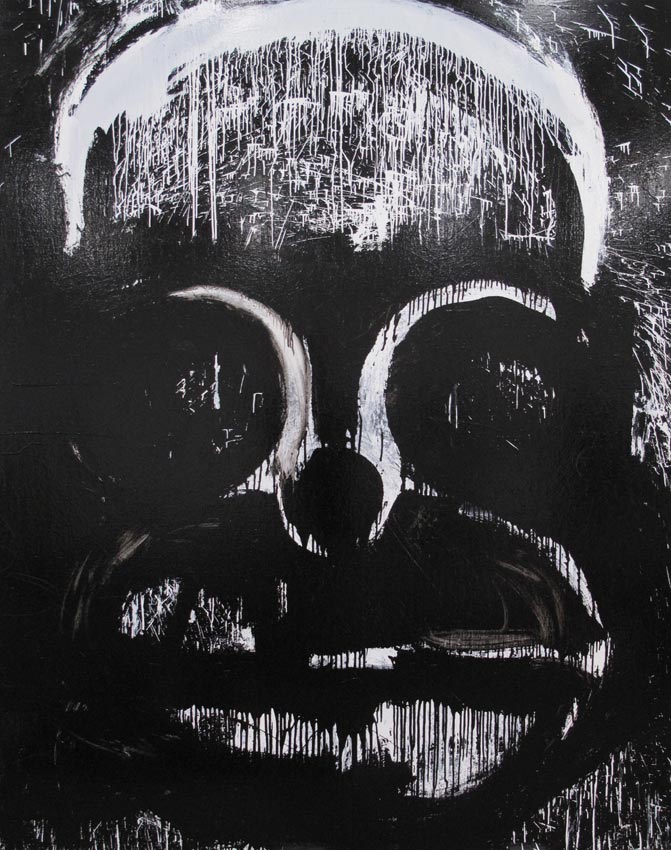
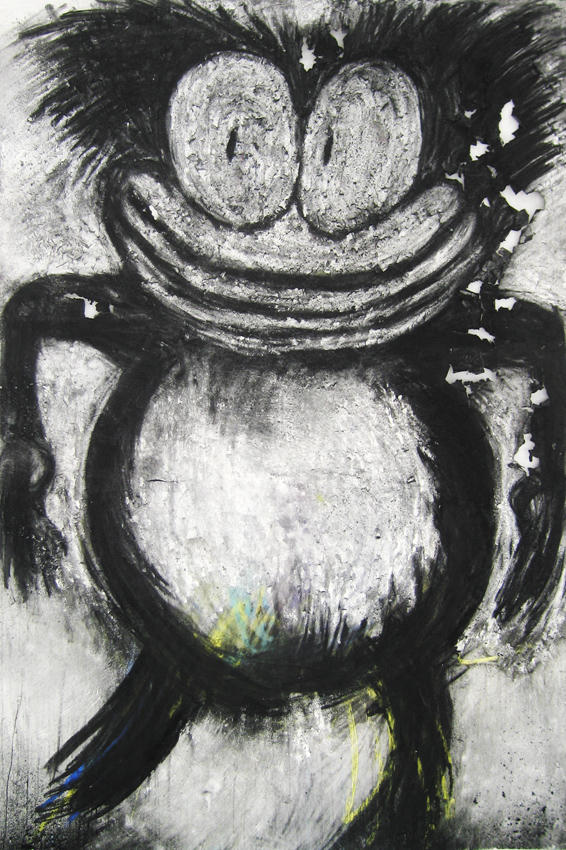
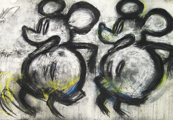
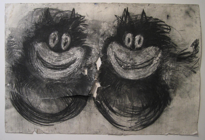
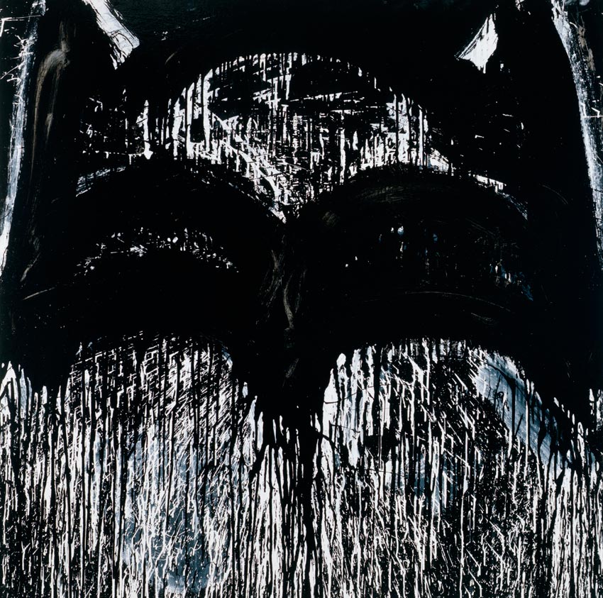
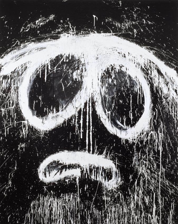
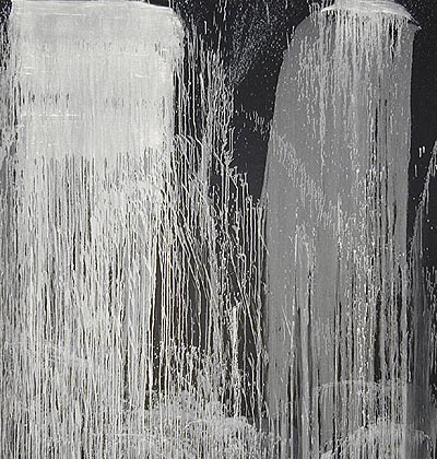
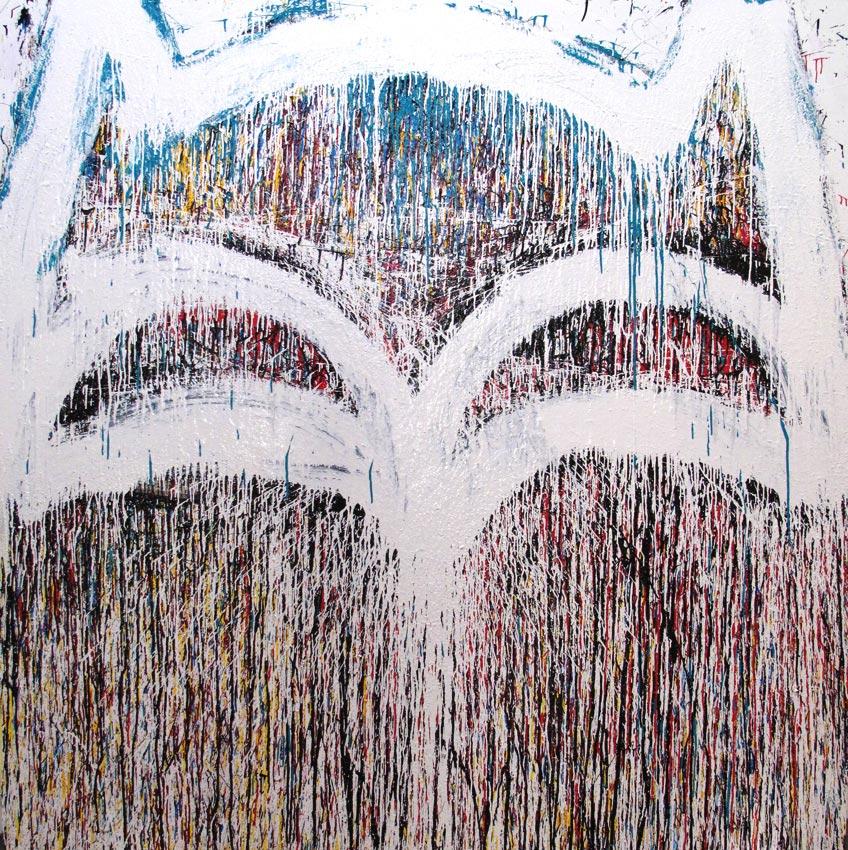
What prompts the move to paintings of cartoons at that point is not clear. However, a string of four prestigious awards between 1992 and 1997, including a Guggenheim Fellowship, flag quiet institutional approval before any market excitement. The change finds favour where it counts. From there on, it’s hard to chart much stylistic development. Paintings mostly feature frontal cartoon heads or single figures on usually white or blank grounds, outlines wildly reworked in household enamel with a broad brush, resulting in a hail of drips and dribbles, a drastic coarsening of outline. The message is essentially desperate and far flung, but we’ll come back to that. Occasionally there are two figures or a repeated one, underlining a strict format to person, narrow relations. The charcoal drawings, more interestingly, allow a certain amount of erasure, giving the figures a different kind of distance or scrutiny, more hesitation. But the central issue is the use of basic print figures or comics in painting; the clash between vivid personal instantiation and bland, simplistic icons. Either the artist’s furious workings elicit some unexpected nuance in expression from the icon or the icon implacably stares down all manner of outrageous license. Either way, expression and subject emerge curiously heightened, even where feeling ultimately runs to pathos.
This is where I return to my first point. What makes the contrast between freely painted and reliably printed instance of iconography so compelling is that the issue has gnawed away at painting for the last sixty years, or so. Despite the seeming frivolity or cynicism, there is a respectable formal issue here. The problem is that comic strips and animations, or ‘cartoons’ in this sense, throughout the twentieth century steadily converge upon Expressionist fundamentals or streamline formally, largely as a requirement for animation and bring with them a new range of mythical characters and tales to what were seemingly remote or arcane formal resources. Eventually these prove irresistible for painters, as they discover that the stylistic gap between say, Walt Disney and Paul Klee or Joan Miro is actually not that great. At the same time, it is a pivotal point for twentieth century art, as it implicitly exchanges a quest for pictorial absolutes, in abstraction, for relativity to common social practice and figuration. Painting is then defined in a radically different way. Thus, we find Roy Lichtenstein in the 50s initially attempting gestural versions of Donald Duck, for example, soon followed by Andy Warhol, Peter Saul and others but in each case the interface between Expressionism, as the overtly gestural and standard print icon proves unsatisfactory, perhaps lacking authority or signature to gesture. The painterly proves a minefield for such content. Artists then swing to the other extreme and suppress the gestural, become deadpan or passive rather than hamming it up in their rendering and this proves surprisingly effective. It is quickly recognised under a variety of labels, but the one that sticks is Pop Art.
Pop artists are still free to vary content, exaggerate drawing (as in 60s Saul, later Chicago’s Hairy Who) subtly adjust composition (as in Lichtenstein) and inject a more Surreal sensibility to graphics sources, even as this steadily dilutes the project, but heavier, freer facture pretty much cancels it. The drift to photographic sources extends the project but scarcely offers greater scope for extravagant handling. However, where print source is relaxed, to no more than an obvious template or design, as in Jasper Johns’ famous alphabets, maps and flags (the inspiration for Warhol’s turn to graphic sources) the painterly is granted more leeway. New Image Painting carries some of this, with its flattened, silhouette-like imagery, often on grounds, attenuating graphic derivation, allowing modest gesture by the late 70s. The late work of Philip Guston by contrast, does not strictly follow from Pop Art but rather attempts to recover figuration after abstraction only to encounter blundering comedy where the formal primitives of Expressionism and the spatial coups of Surrealism have seriously been eroded by the practices of comic strips or cartoons. What we get are no more than nods to print sources in humorous spindly limbs and clumping boots, pudgy hands with smoking cigars, empty (back) grounds and frontal projections, the laboured linear modelling to volumes. All signal not so much an allegiance to common print sources as the impossibility of recovering Expressionism or Surrealism in light of subsequent developments. There is no way back, other than as farce.
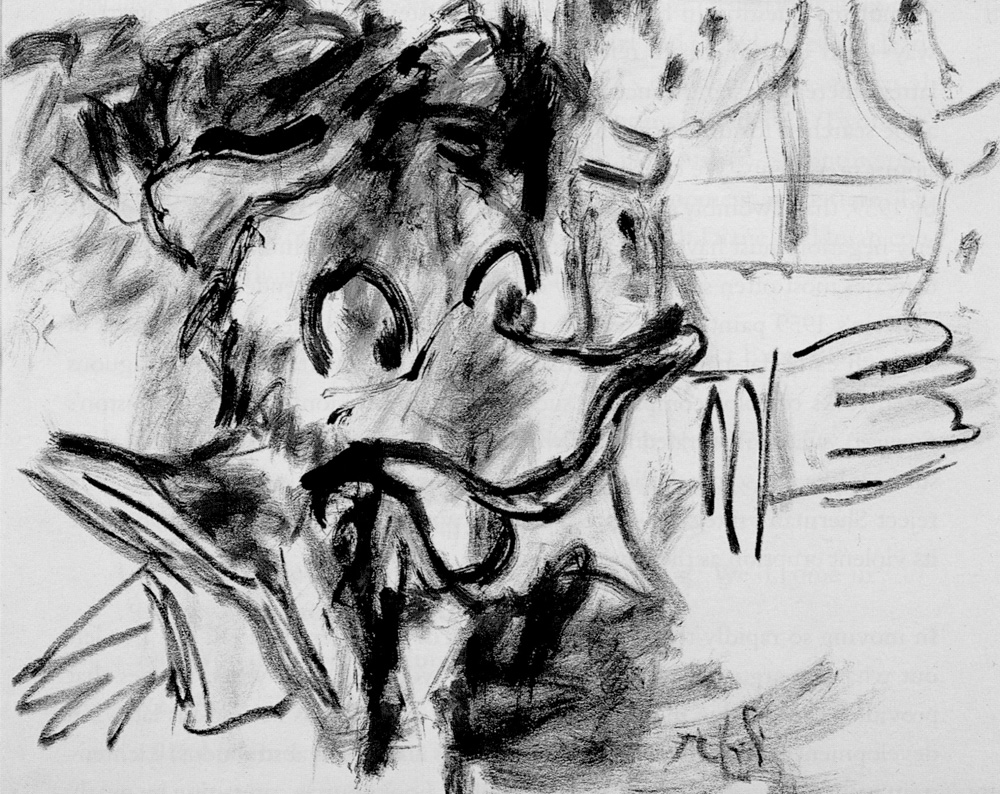
Guston presents a murky, rambunctious middle ground for painting and it was initially considered deeply embarrassing by critics. But the break with his abstract work is also a return to earlier figurative interests and confirms an abiding suspicion of conformity and decorum. In fact much of Guston’s distinctive churning brushwork and modulation to colour from his abstract phase are preserved in the late work, figuration only steering it to more concrete and comic ends. Pensato lacks Guston’s range and resources but her attention to deliberate re-working, erasure and incompleteness all hark back to The New York School, especially de Kooning. She admits as much in the Kalm video. The work is initially about such process exhausting the support, to the point of disintegration. In the drawings the paper is usually erased and inscribed so heavily or violently that it wears holes in it. This is extreme distress and while not distinctive formally – precedents range between Burri, Tapies, Rauschenberg and Kiefer – here acquires a particular expressive tenor. Even before the introduction of cartoon characters, the artist’s attentions ultimately overwhelm compositions. Works become abject documents of a terrible or disproportionate obsession. It is not the struggle for resolution to lines, shapes or tones so much as the artist’s relentless toying with them, the need to experiment and exhaust options that is foremost. This tells us something about the artist beyond her influences. And it suggests why at some point the paintings need more to go on than abstract compositions.
As noted, the artist commences drawing cartoon characters in her student days. In the Kalm video she explains she found dolls of cartoon characters preferable to standard still lives for drawing exercises, a telling remark given their later expressive treatment. More puzzling is her use of 3-D rather than 2-D models, given her work’s indifference to volume and setting. She converts the dolls back into 2-D instances as an actual encounter, some private distancing. But this is not at first obvious or essential to the work. From the first though, figures declare a sort of formal rigour to curves and angles, ellipses and outlines. They are a bit like a designer’s sketches, albeit a decidedly reckless and indecisive designer. But the sense is of laying down foundations, getting to the root of the matter. In this respect Pensato drives a harder bargain than Guston, looks for her pictorial fundamentals or primitives within just cartoon characters, with just line and tone. She can’t do as much with them or expand context, but the drawing stresses shape, proportion and balance in ways quite different from naïve or graffiti artists, from preceding Pop Art. She finds something of her own and is rewarded for her patience. And these issues provide the artist with exactly the kind of tasks that dominated her abstract work. They allow her to target her gestures to cartoon characters in a way that an earlier generation could not. Understandably, artists of the 50s were more concerned with preserving the identity of a Donald Duck or Dick Tracy within their expressive facture, in a sense are more precious about the detail, more curious about what it would do to their gestures rather than what their gestures might do to a print icon. That problem does not arise for Pensato by the mid 90s. She can afford to take more liberties because of Pop Art’s acceptance and yet because of Pop Art and a new appreciation of cool or detachment, gestural liberties are then pretty much sidelined.
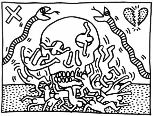
Neo-Expressionism is enlisted by Saltz to bolster Pensato’s pedigree. But so-called Neo-Ex is in many ways counter to her cause. Where Pensato relies upon a protracted engagement with a familiar print icon, Neo-Ex in its German and Italian variants opts for the briefest, most cursory of diagrams or metaphors, pointedly shuns more polished or common iconography. While both assert a vigorous, often thin facture, Neo-Ex’s interest and influence lie with grander, more extended allusion to mythic and historical themes usually in arch or satirical terms. This is true even of a Keith Haring. Nothing could be further from Pensato’s regressive focus on children’s cartoon characters. Here too, Pensato is effectively marginalised, this time by her content. While the paintings follow her drawings in adopting cartoon characters and largely remain confined to black and white, they differ significantly in technique and ultimately expression. Brushstrokes do not gouge the support or stress erasure as much. There is accrual and pentimenti certainly and the surfaces acquire a glossy weight but more prominently, they overload the image with dripping and splashes, with sheer breadth of gesture and scale. They demonstrate a splashy extravagance. The elemental nature of the icon is heightened at the cost of a torrent of drips or spills that trail down the canvas, literally draining gesture of traction and body, metaphorically setting off a trail of leakages, a dispersal of energies.
The cascade of dribbles in more extreme instances recalls the work of Pat Steir, as is sometimes remarked. Perhaps we need a ‘drip off’ between the ladies to compare technique to forms? For Steir the largely uninterrupted and measured dribbles running the length of the canvas sustain a faltering linear field governed by dilution and gravity; are about a delicacy and calculation, a lightness and loftiness of touch. For Pensato dribbles defuse the bludgeoning gesture, are like ripples or shrapnel emanating from the impact. One is a shower of serenity the other is collateral damage. Where Pensato’s drawings declare a chronic inability to leave the work alone, the paintings flag an artist that can’t wait to unload, big time. The paintings are unmistakably more aggressive, confident and reckless. Why this should be we shall come to, presently, but this greater assertiveness is part of what the paintings are about, rather than a criticism. Another part is the veil of trickles that lead the eye down and out of the picture. These are so prominent yet it is by no means clear what they are driving at, beyond gravity and pigment viscosity. It emphasises a precarious fluidity to construction, perhaps a melting of efforts, in other ways a strange ascendance. The icons rise above the drips, even as they melt; achieve brief recognition but deposit considerable residue somewhere below.
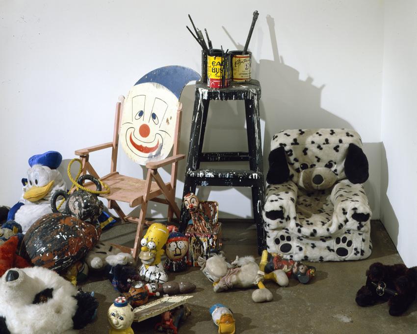
Can the work stand on this much? Or does too much quickly fall away? Fail tradition? I am unsure. I suspect the artist too has doubts, increasingly finds herself a little too comfortable with the process, getting off a little lightly. But it is not easy to see how she might develop the work. She is unlikely to expand upon her cartoon sources, even within a black and white format, to say, A.R. Penck-like structures or Donald Baechler-like restraint. Iconographically, she is locked in. Occasional wipes with rag vary the gestures but all those dribbles in household enamels offer at most a veneer of street cred, echo ancient flings at defiance or liberation. These days spray cans are the weapon of choice there. Beyond that, enamels are not capable of much more than coats. Greater versatility and nuance to pigment would seem to hold no great interest as yet either. My preference would be pressing the line with abstraction a little more, but the artist proceeds in other directions. She unexpectedly resorts to installation and performance. This starts in the 90s according to the artist. More recent examples include her 2006 show at Parker's Box in Brooklyn featured a small installation of soiled dolls then her 2009 show at Petzel featured site-specific drawings – effectively all-night performances - while later shows include tableaux of paint-spattered props and furniture drawn from her East Williamsburg studio, which she vacated around 2010. Both activities have since become integral parts of her exhibitions. Presumably, this aspect appeals most to Lisson.
Both aspects allow us to appreciate more of the artist’s process but whether it enhances is another matter. The assemblies of paint-spattered dolls, stools, benches, matting, plastic milk crates (where would painters be without milk crates?) exhausted drop sheets, cans of stiffened brushes and assorted pin-ups, among other detritus, all foster the clichéd image of creative chaos, of a deeply entrenched and eccentric practice, perhaps hint at a hoarder. Yet isolated within a spacious gallery, the arrangements look arty or staged; something Adrian Searle detects. We now see the full extent of her gestures, just where the collateral damage runs to but it gives them a curious theatricality, shallowness. At the same time there is something ruthless, a disregard or contempt for her own circumstances. One is struck by not only the sheer number and variety of her collection of dolls, from Disney characters to The Muppets or Sesame Street, to The Simpsons and South Park, Pensato’s subject matter carries no especial nostalgia, but also the prompt abuse they endure, their disposability. Everything cops the spray, the stain of her sweeping dismissal. Yet they are ever replaceable; essentially interchangeable. It’s all a little bit sad and a little bit creepy. The pin-ups of Robert de Niro (Pensato is the 2012 recipient of the Robert de Niro Senior Award) Mohammed Ali, Elvis Presley and Abraham Lincoln spread her energies to Americana and notably the masculine. But we need not psychologise the inspiration too much. The company she keeps and its consolations are uncomfortable enough. We’re not exactly in Miss Haversham’s parlour, but you get off at the same stop.
The installations reveal soft targets for her gestures, proximal proxies and soiled surrogates. It places everything at a comfortable remove. It also explains why the gestures grow so flamboyant and self-regarding. There is not really that much at stake, as content. The gestures never really strike home, hostages take the hits. It also explains why performance and site-specific works then appeal as a further avenue of expression. In a sense, these formalise the short-term, distanced nature of the engagement. But where does this leave the paintings? The aim may have been to spread the burden, ease the onus on them – as the studio practice attests – but this only leaves the gestures somewhat calculating and pitiful. Whatever insecurities the artist experiences in invoking the simplest of icons, her supporting cast of comforters render absurd or exaggerated. Whatever expectations she may feel in their company hardly sanctions such petulant excess. The work finally deals in a private pathos but with its support and growing recognition, it reflects a great deal of the art world.
A shorter version of this article appears on CAP'S CRITS.
Joyce Pensato @ Lisson Gallery
1 post
• Page 1 of 1
Joyce Pensato @ Lisson Gallery
![]() by CAP » Mon May 05, 2014 3:16 am
by CAP » Mon May 05, 2014 3:16 am
-

CAP - Posts: 1081
- Joined: Thu Jan 06, 2011 11:38 am
- Location: Off-world
1 post
• Page 1 of 1
Who is online
Users browsing this forum: No registered users and 217 guests