3511w
Another version of this article appears on CAP’S CRITS where it has the advantage of opening links in a separate window. This saves you bouncing back and forth between text and illustrations...
This is not bad, certainly the best thing Stewie Shav’s shown for quite some time, which is not saying much, admittedly. And it’s probably the best thing around London’s commercial galleries at the moment, which again is not saying much. (Kehinde’s stuff is too brittle and academic for me, JJ). Anyway, Cooke reprises familiar motifs with new opulence, less emphasis on figures than still lives in cheesy fantasy settings, all in a warmer, richer palette and as usual, on an imposing scale. It’s an attractive package and given the artist’s reputation, a little surprising not to find at least one review online. But after ten years of artworld stardom and with the artist now active as a critic as well, perhaps the public needs a break or feels the artist needs one. I must admit I hadn’t really looked at his work since the 2010 show at Modern Art, when all the reeling ‘Stumpy’ characters - the artist as lonely fool or phoney basically, occasionally wearing a chef’s hat, presumably a pun on the artist’s surname - announced a regrettable self-indulgence and grinding retreat to duller rendering. ‘Disappointing’ would be putting it mildly. I pretty much wrote him off after that.
This time I’ve done some web research to fill me in on changes and to review the oeuvre or project as a whole. We’ve both moved on. Actually, it’s surprising how few online reviews Cooke has received throughout his career. His breakout year was definitely 2004 when he had reviews in the New York Times and The Observer – but since then, pretty much zip. There are interviews and promos that tell you how clever and intricate the work is, how market demand has created a waiting list among collectors, (this may have changed I suspect) but actual interpretation and assessment seems of little or no interest anymore. There is a long and murky speculation on the relevance of quantum mechanics to Cooke’s pictorial structures by Suhail Malik on the artist’s website (undated), but at best this provides slender return. Malik is strong on science and philosophy, less so on art. I had assumed I would find a clutch of works in the Saatchi Collection, but apparently Charles has not bought or shown Cooke. That also surprised me, but just goes to show there are other routes to market success.
There are special difficulties in judging Cooke’s work from reproductions. A fanatical attention to detail in places is only perceptible at very close range or in selective close-ups. Unfortunately these are not available online. However there are videos that demonstrate this feature through selective zooms in and out of paintings. And while it is important to appreciate the scope to composition established by such detail it is less crucial or extreme in recent works and is hardly the only or most important attribute of the work. The detail in some ways distracts from an overall structure in which rival or layered versions toy with a stylistic hierarchy, suggest none as comprehensive or realistic; imply a pictorial pluralism. This is of course prime Post Modern real estate, somewhat on the Surrealist wing and the work sits comfortably alongside that of Glenn Brown, Richard Patterson, Neo Rauch and Guillaume Bresson, to take a broad cross-section. Cooke is less inclined to pastiche than Brown, less eclectic than Patterson, less socially committed than Rauch or Bresson, but this allows his work greater formal rigour, more integrated iconography and a more personal agenda. It’s swings and roundabouts really. If not a prime mover, Cooke is at least a shrewd developer.
Criticism, such as there is, raises two objections. Ken Johnson, reviewing his 2004 show at Andrea Rosen in the New York Times concluded that ‘Mr. Cooke is having fun with a kind of high-end illustration. Whether he can avoid being trapped by his own formulaic devices is the question.’ The criticism was of Cooke’s layered structure, ingenious trompe l’oeil and nerdish detail but actually the same can be said of any artist achieving sudden acclaim. How does one sustain it, how much of the future will be pale imitation, enslavement to one’s hard won formulae? To abandon them promptly only cheapens them, leaves them as gimmicks or novelty. To adopt some other, less obvious formula only places a premium on novelty. The accusation of illustration is tricky and to be returned to shortly. Laura Cumming reviewing his 2004 show at Tate Britain (Art Now) in The Observer concluded that ‘The downside of all this invention, however, is a gothic interest in ghoulishness - bleeding Halloween lanterns, kitschy eyeballs and severed heads straight out of the model horror-shop of Jake and Dinos Chapman. They don't fit, they don't convince and they are the worst of his work. Maybe Cooke will someday abandon them’. The criticism here is of iconographic inconsistency and possibly redundancy. It is clear from the artist’s comments and the persistence of such imagery, even in the current show; that Cooke aspires to a range of imagery within a work, from the literal and realistic to mythic and symbolic, indeed from the kitsch and crude to the unusual and abstract or obscure. The inconsistency Cumming detects properly lies in an over-emphasis upon the macabre and clichéd. Its prominence creates an imbalance.
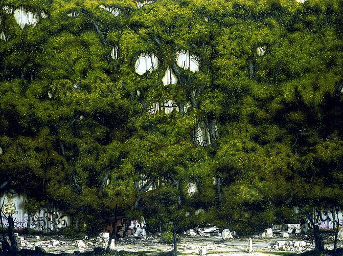
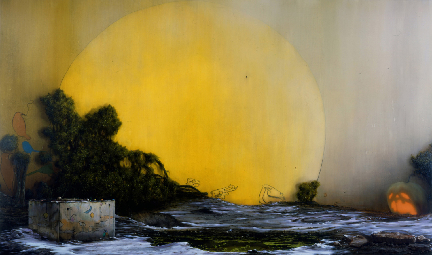
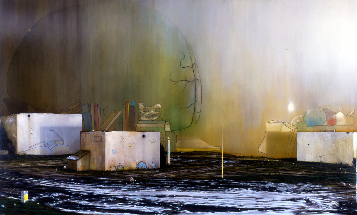
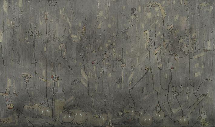
Cooke’s imagery commences from a theme of decay, exhaustion and neglect. In a series painted between 1998 and 2000 of small, exquisitely detailed interiors; rooms that have fallen into disuse or are crammed with possessions, notably books, notably based on a photograph of Francis Bacon’s studio. Subsequent work turns to landscape with ruins and abuse, often in a vast, largely vacuous panorama. In Don’t Mess with My Message (2002) and Mirrors (2003) detritus includes decapitated heads but significantly, detail is pushed to the edge of the painting, scale stresses a comfortable viewing distance. The artist dallies at the margins, busies himself with witty asides. However the ‘big picture’ essentially rests upon a vacuum, a lack of more central focus. The high gloss varnish finish to Mirrors ensures just that – that viewers confront their own reflection in the blackness. This psychological dimension proves particularly troubling in later work. Following work, such as Silva Morosa (2003) – ‘Moody Forest’ according to a Google Latin translation – exchanges a vast night sky for a mass of impenetrable creepers over a white wall covered in graffiti. Here scale is no guarantee of distance though, at the base of the picture a wrecked car and house offer conflicting versions of scale and distance. The large skull formed by gaps in the creeper echoes the kind of imagery found in graffiti (particularly in the lower left of the picture) but seems a little laboured, if only by Dali or Ernst’s standards. Where the artist wants both banality and ingenuity, something has to give.
Similarly, the game of placing pictures within pictures, of toying with scale and perspective, first achieved real dedication in the work of De Chirico, to be ably developed by Magritte and Dali. To give it a Post Modern twist, Cooke varies style of rendering, as outline, silhouette or monochrome and strings various planes or volumes together, offers gritty wear and tear in painstaking detail as in Morning Is Broken (2004) and Thinking (2005). This too creates a kind of detachment. The trouble is decay and neglect start to look a little too cute, a little frivolous. It is probably this aspect that Johnson dismisses as ‘high-end illustration’. ‘Illustration’ as criticism in painting usually means a picture too easily interpreted into familiar content. As if to counter the objection, Cook’s work soon leaves its outlines more ambiguous or stylised, shuns more elaborate or ingenious levels to a picture, as in Bad Buffet (2006) and Get Rid of Meaning (2006); approaches a kind of biomorphic abstraction in Night Thoughts (2006). There is certainly nothing easy or familiar about these outlines but it is less the artist’s imagination or invention in drawing than a deft exploitation of preceding layers of thin grounds, vigorous and vertically brushed veils that is foremost. The work now traces chance suggestions amongst these or pretends to; emphasises a different kind of overgrowth or decay. Layers are further emphasised by the heavy gloss varnish, at odds with the casual, sketch-like quality to outline.
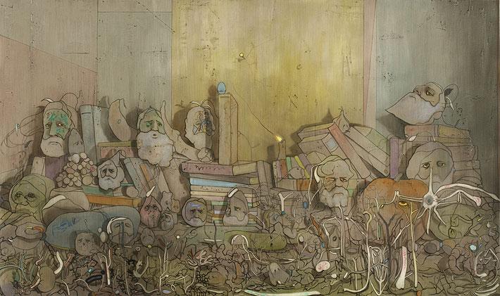
Night Thoughts also introduces a perspective of lit windows to high-rise buildings at night, as veiled setting and geometric counterpoint to the organic flow of weeds and their puzzling fruit. The contrast between Modernist geometry and infestation or erosion grows more pronounced in following works and remains in the current show. This contrast leads Johnson to suppose a dystopian view of civilisation, a whimsical abandonment of ideals and reversion to noxious nature, even in 2004. But the ruins and overgrowth, like the microscopic details of stones or flowers weeping or smoking, are not to be taken too literally. What becomes clear in subsequent work is that the derelict setting is really the abode of a stereotypical artist. The overgrowth and errant embellishments then figure as metaphor for tradition feebly maintained or gone to seed. The various amorphous figures – indeed even foodstuffs – soon rhyme with the artist’s persona, an absurd painter or painter of the absurd. The tipping point is New Accursed Art Club (2007) where a group of grey bearded men in strange robes congregate among weeds, apparently seeking inspiration in nature. In fact many of the weeds carry labels like ‘Woork’, ‘Thort’ and ‘Emotion’ suggesting issues for the club as well as a curious illiteracy amongst weeds or artists. Yet the figures are depicted as virtually two-dimensional or cut-outs and while this helps to signal their emblematic roles, something about the long beards and mask-like faces does not quite ring true. More disturbing is a video of the artist describing the group as “a reactionary, conservative group of makers, involved in mutual appreciation and supporting each other against the wider world”. It is hard to see any of that in a group where each member looks in a different direction, only one seems involved in actually painting or making anything (and that a self-portrait) and their appearance seems anything but conservative. It is not fatal for an artist to misinterpret their own work of course, but for one holding a doctorate in art theory and active as a critic, it is a little embarrassing.
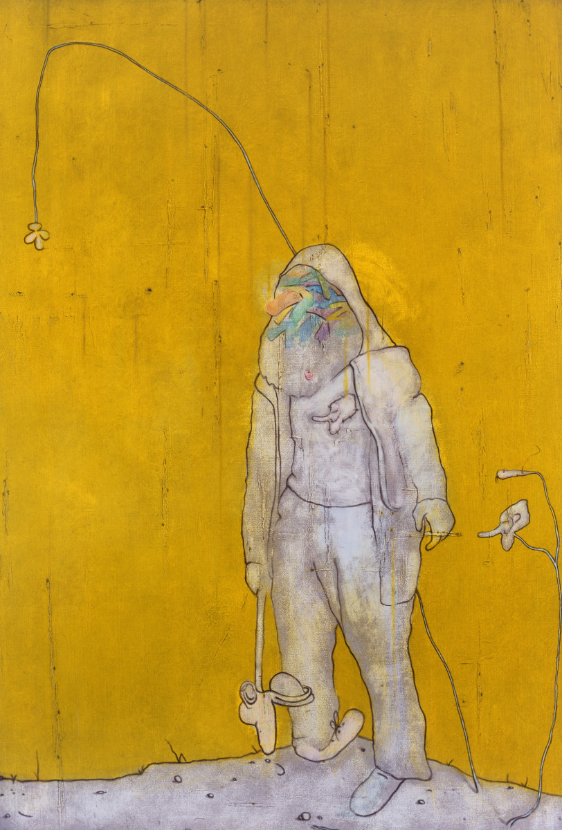
More to the point, the group is all male and rather than artistry it is age that is denoted by the long white beards. We have a group of old farts or codgers perhaps, but the lack of detail to costume and pose is not simply coy stylisation but an unwillingness to flesh out more incisive caricature. This is because Cooke never really believes his projected situation for painters or art. Obviously, if he did, he would not still be painting, certainly not enjoying the success he does. The New Accursed Art Club members are really straw opponents, traditionalists realised on only the vaguest of terms, a mythical old guard around which he can weave a more sophisticated vantage point. But the problem is two-fold: how to flesh out the character of the traditional painter while granting him a null identity. A work such as Night Studio (2007) grants the figure more contemporary costume while reducing the head to a furled wrap, perhaps bandaged. Again, the figure wanders into a foreground of weeds, swigging from a bottle and with what looks like a mahl stick in the other hand. Here also the Modernist concrete bunker is firmly identified as a studio. Following works such as Painter’s Deathbed (2008) and Aleph (2009) emphasise the falseness of the artist’s beard, the masking to the face. By this stage we do not really have an old codger expiring at all, but a younger one weakly pretending. This hardly builds conviction of course, quite the contrary. The artist is rendered as no more than a crude disguise, as essentially evasive and dissembling.
While masks and disguises accord well with the many layers to Cooke’s pictures and carry the formal arrangement through to depiction of the person, the theme nonetheless is significantly modified. It is no longer a matter of tradition failing but tradition poorly grasped, if at all. Given that Cooke’s work has up until this point stressed an almost Olympian detachment, it should not come as much of a surprise that dealing with people on closer terms may present difficulties, thematically and stylistically. He is torn between a cartoon character and the need to substantiate what is really a figure of bad faith. As noted, Cooke welcomes a range of imagery to his work, from high and low sources, from the crude to sophisticated, so there are any number of options open to him in portraying a traditional painter as prisoner to Modernism. Initially he pursues a linear or graphic rendering, in works like Painter with a New Brush (2007) but this is tepid as caricature or social observation. Again, the result hovers in cuteness, with its twisted feet and emblematic T-shirt; it does little more than broach Larson territory. The real problem, however, is Cooke’s ambivalence to his stereotypical Modernist, his need to make the figure into a contemporary, indeed an alter ego while also casting him as forlorn relic. The results satisfy neither. A painter then only amounts to various clumsy disguises, unconvincing poses, perhaps a token nod to bohemia or cool. But we are not talking about painters now, just poseurs
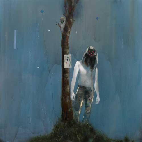
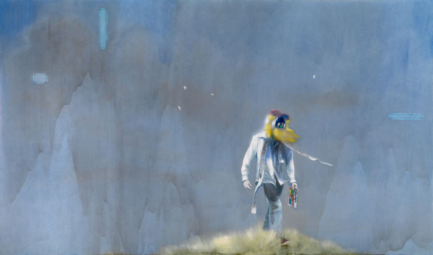
This is so superficial that the rest of the arrangement of Modernist geometry and its insidious overgrowth begin to look equally brittle, equally false. This may be why the painter is increasingly pictured without an architectural setting. In works like Experience (2009) and 1989 (2009) the artist is pictured simply on a hilltop, perhaps with a tree trunk behind him. It may be that given the attention to the figure, an elaborate setting would just overload the picture rather than extend its scope. But greater attention to the figure irresistibly draws Cooke into greater realism and this too threatens the variety or plurality of layers to the setting. The background would simply read as a theatrical backdrop once the foreground acquires compelling realism. There are small studies, such as Painter’s Grandson (2008) and Stink Eye (Nocturnal) (2009) that show much bolder handling (and the influence perhaps of admired painters such as George Condo and Ansel Krut) and suggest Cooke looks for more stylised solutions, but in the end he cannot resist the highlights to sunglasses, trendy trainers and baseball caps. The self regard by this stage is crippling. Is this what happens when you make the Scene & Herd pages of Artforum? The need to see the painter, even in painting, as fashionable, a hipster, is frankly pathetic. By 2010 the figures are largely pictured by night, virtually eliminating a setting. Looking again at them, this still seems the point where Cooke lays all his cards on the table as a painter of the figure and comes up short. Not for nothing does the painter acquire the name ‘Stumpy’ in some pictures, not for nothing do the backgrounds look increasingly thin.
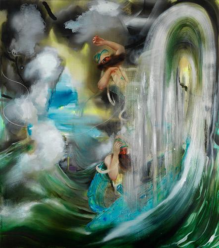
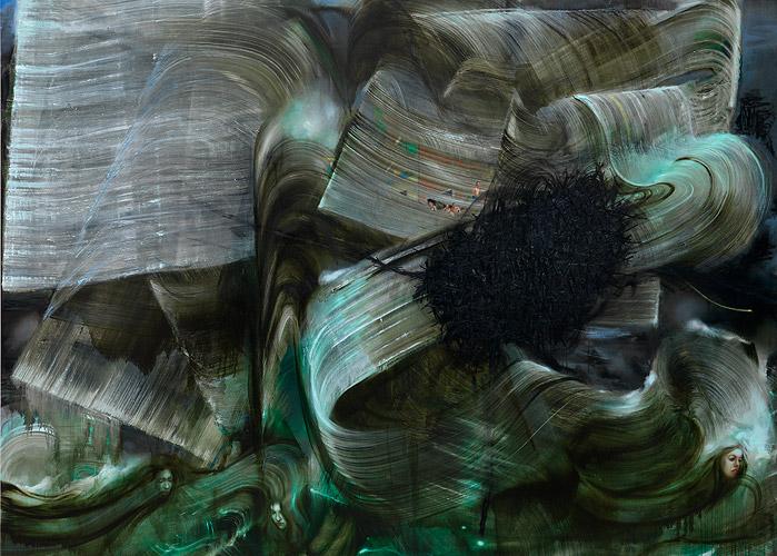
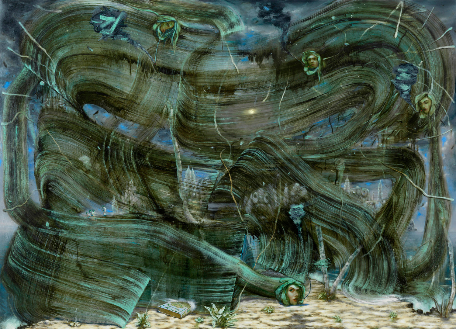
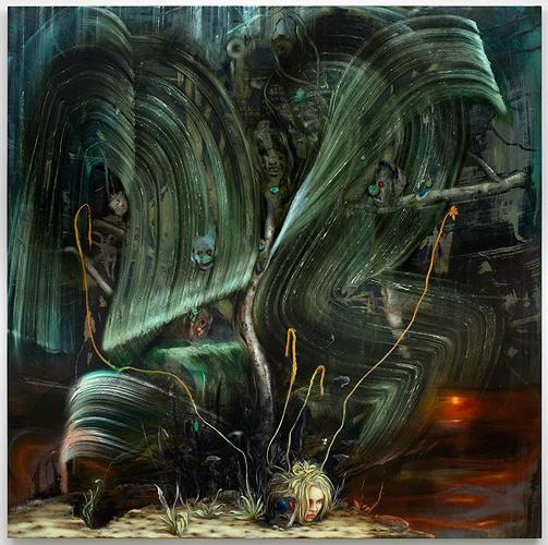
Where does the work go from there? Briefly the artist seems all at sea in Spectator 1 (2010) or at least uncomfortable, even at the shallow end. Then the work undergoes a drastic change. Cooke introduces massive sweeping brushstrokes, as if made by something like a broom. I remember getting similar results using those strips you attach to the bottom of a door with a short brush running along them. It worked a bit like a squeegee, but with bristles. That was in my gimmick period, but enough about me. However Cooke initially contrives a door-width brushstroke, they are, needless to say, delicately reworked, shaped, masked and highlighted. Yet the initial impression is of tremendous fluency and turmoil, an almost claustrophobic immersion in vigorous gesture. In terms of underlying theme, they may be seen as the flipside to Modernist geometry – Modernist expression. For classicists, it’s the Dionysian turn. Rather than smoothly assimilate architecture, the big brushstrokes are often blended or extended into nature, as in Tree Engulfed by Waves (2011) or Storm with Shattered Tree (2012). Here Cooke actually does manage to mix the crass with the critical, kitsch with a catch. But the results are not pretty. Just as significantly, these works are largely populated by women. Churning brushstrokes occasionally blend into the flowing hair of a placid maiden, as in Dreaming Head (2011). In Bathers (2011) nudes bathe in a forest, not quite classical, but we have all been here before. In The Honeymooners (2011) more than the earth moves for them. Lovers in a Clown Storm (2011) endure more violent separation.
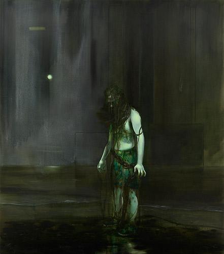
‘Love Will Tear Us Apart’: we get the message. But is it really fair to blame the weather? Sadly, these are not quite fun pictures either. Partly it is because they are so laboured and elaborate, partly because the spatial discord created by the enormous brushstrokes points to a deeper disquiet. They enact a pictorial or painterly hysteria that is genuinely uncomfortable. Cooke embraces his inner de Kooning (or perhaps Richter) if only as consolation for other failings, but is unwilling to relinquish his inner Bosch to accommodate it. The result is a kind of Jekyll and Hyde picture, convinced of bold gesture, so long as it allows careful qualification. Not surprisingly the results are pretty ugly. Curiously, no focussed female identity emerges from this mayhem, not even a weather girl. Even as just heads they hardly inspire, technically or thematically (in this, Johnson’s criticism of illustration continues to haunt the work). Later, a fatality or thanklessness is ascribed to la belle femme, but by then it looks like sour grapes, sounds more like Devil Woman. For the most part they remain blossoms or shoots though, on holidays or by the pool, smoking for composure or weight, but importantly, at a distance. In Spring (2012) Cooke’s avatar, the chef’s hat, makes a reappearance in a daubed sports car (at a guess a Lola, possibly a T260, but the rear looking a little more curved than a T260...) and while he glances knowingly towards us, his attention now lies in the background, where bikinis await in the grounds of a hazy villa, complete with gaping skull facade. Giant brushstrokes still lurk, but these now disperse into smaller gestures, foliage and flower for once given generous treatment. Actually this occurs in Bathers as well, but Spring I think the more accomplished effort.
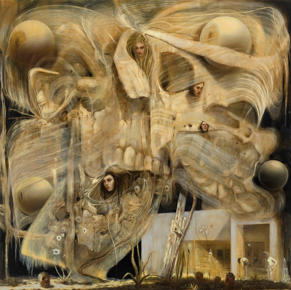
If Cooke has learned anything from his genre busting it ought to be his own strengths. While technical challenges and professional ambition may tempt him into all manner of virtuosity, his temperament is finally his biggest obstacle. He is just not built for the up close and personal. It only leads him into faking it. Nor is he inclined to speed or impulse. That only leaves him in endless rehearsals and replays. His default setting is something like landscape, a more expansive and considered view. It gives him room to move, if only dither. While it obviously allows figures, as yet they are better given less emphasis but kept busier. He does better with symbols, tokens, metaphors or metonyms, although could do better with less obvious and more varied ones. His forte is really a general smouldering atmosphere, a mesmerising accretion of details, an attention to light or time of day, haze and glow. Wisely, the artist returns to his home ground for the current show. The big brush with nature has pretty much abated and with it the artist revisits his fabled Modernist edifice, in the appropriately titled Hubris (2013). Here we once more have the layers of stylisation, from geometry forward, 2D to 3D, while realism is held at bay by cliché and florid iconography, culture advanced by clutter. Battered tomes and buttered tones greasily amass, they challenge the view, to ask of you, and greedily canvass; the viewer’s taste in traditional tricks, in truly tortured fare, but whether they cook the stew or stew the Cooke, depends upon appetite and repair.
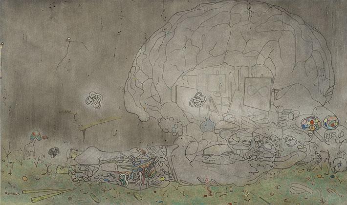
Finally, the artist’s reconsiderations are given literal enactment in Prospectors (2013). Initially, I understood the title as Prospectus, and given the prominence of the large tome to the foreground, had assumed it announced a mock determination for Cooke to play it by the book. But Prospectors is really about a return to his roots, a patient excavation of sources and inspiration, beyond textbooks. The strange rocky outcrop with embedded eyeballs, vaguely recalls Ernest’s The Eye of Silence (1943-4) and an implicit Surrealist heritage, but the rock formation may as easily derive from science fiction. It is worth recalling that as early as Cathedral of Erotic Misery (2000) Cooke evinces an interest in this low and restless genre. It may be that this will provide a further seam in phantasmagoria, a new line in science gone feral, fiction in need of theory. It may prove a more promising avenue in which to see himself and others.
