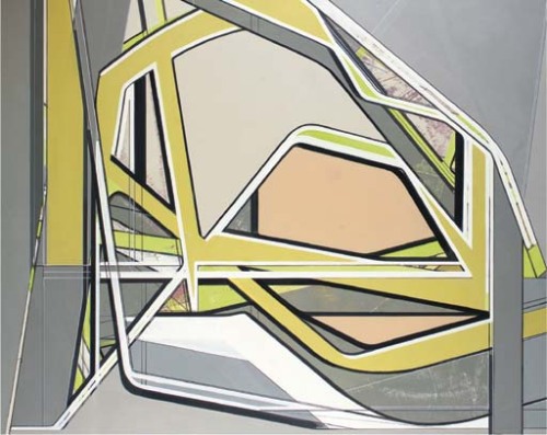
There is some modulation to colour – which is where on-the-ground eyeballing would have come in handy - but as paintings, these are works dedicated to scale and shape – very Minimal, very techno, very dry. They’re not super huge, but generally run to 200 X 250cm, big enough to blow the shapes out into the viewer’s space, have you shuffling back and forth across the gallery. The options as I see them are to press on into 3-D modelling, build on the overlapping depth and light touched on in works from the later noughties, concede some more concrete object, or to retreat to greater 2-D austerity and abstraction. The current show chooses the latter and duly restricts colour to shades of grey. A number of works toy with bowl or screen shapes, again, assign strict curves, rounded edges to designs even before announcing function. This is abstraction in a very Post-Minimal key. It nods to industrial standards but then skips application for loftier concept, a futuristic orientation. Somewhere you can hear Carl Andre or the ghost of Don Judd whimpering with trepidation. How very, very dare you! Theoretically, this stuff should really take off in New York. It’s so cool and knowing, so corporate and accommodating, so fat and flip. But Nitsche remains in a Koenig niche for some reason. He gets a favourable review from the anonymous critic for New York Art Beat, but that’s not much more than a rehash of the gallery’s press release.
Part of the reason is surely that all these design concerns are now digital and belong in the realm of AutoCAD or similar. Exporting them back into the analogue world of painting looks frankly Luddite. No one goes back to the drawing-board anymore. Better to have them printed off or inkjet-sprayed directly onto massive canvases, preferably in somewhere like China or India where it’s cheapest. But stills won’t really fill the bill in this world anyway; the ambitious designer wants walk-throughs, animation and preferably a hip sound track. Frank is as marginalised here as Julian Opie without the sexiness. But Nitsche doesn’t just miss the New York/global gravy train for being a true son of The Bauhaus, even back in Berlin he seems to play second fiddle to old Dresden classmate Scheibitz. Although Frank, the slightly senior of the two, is, I suspect more the architect of their shared project. Scheibitz got the 2005 German Pavilion at the Venice Biennale gig, probably because his work has always been the more expansive, friendly. He has no trouble tracking it through to architecture and civic planning, décor, furniture and sculpture, in a more vigorous, not to say ham-fisted way. Saatchi bought in, early. Thomas has a website. Frank does not. What gives, Frank?
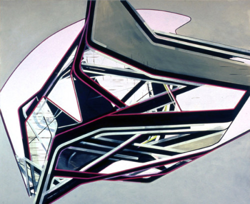
Scheibitz's work predictably runs into bigger problems. His paintings get extra large (around 300 X 400cm, say) struggle with scale and composition and try to inject more painterly facture. The results are even more unconvincing. Both proceed from vast libraries of source material – usually photographic – that collects all kinds of design from street signs to iPods, logos, icons, fashions to machinery. Both combine features into ambiguous or abstract objects, although Scheibitz will sometimes allow these a three-dimensional setting or projection, perhaps shadow. What’s not working for Scheibitz is trying to run with the design and allow painting a little leeway with colour, some wet-on-wet doodling around the edges. Clunk. No, if it’s going to be painterly, then those crisp outlines have to be on the table as well. But if they’re negotiable, how much more of the composition is open to the brushy rushy touch? In a trice we’re back with de Kooning and the whole question of the scale of gesture, the duration of conception. Scheibitz doesn’t have that kind of background or training. He’s strictly art school, and 80s art school. He’s stranded between a sound concept and an over-ambitious execution. There are a couple of videos online of Scheibitz’s earnest but unenlightening interviews that confirm his difficulties.
Nitsche’s work doesn’t run into these problems, but largely through lack of adventure. One starves of inspiration while the other feasts on it. Both struggle to reconcile painting with design or plan, to balance abstraction against more concrete depiction. Interestingly, a central column of drink cans to Nitsch’s show is covered in a collage of amusing trash culture details and presumably is intended as a counterpoint to the formal austerity of the paintings. Actually the contrast is so stark the column hardly seems the work of the same artist. If the humour to the collage seems a bit laddish or obvious (something present in the striking poster for the show as well) it at least signals the artist’s awareness of other aspects of contemporary life. The challenge is to now integrate them more fully within his design briefs.
